PROJECT TYPES INTRODUCTION
Since Doug and Youn launched pod architecture + design, they've witnessed the transformative power of architecture to improve, enrich, and uplift the lives of those it serves, from entire communities to individual families. They've built a portfolio of work that's recognized not only for inspired designs but also for the inspirational role their buildings play in the places where people work, play, learn, and live.
Sometimes the impact of their work has been obvious and dramatic. The Green Building project in downtown Louisville, KY, for example, transformed a crumbling brick building in a forgotten corner of the city into a lively mixed-use destination that has attracted more development, served as a flagship for urban sustainability, and restored neighborhood pride. Multiple awards and other accolades underscore the far-reaching impact of this project.
Sometimes the impact is rendered quietly, perhaps in a grateful sigh when, through creative thinking and sheer determination, they've given a family of four a spacious new home on an impossibly small lot crowded by other houses, that is filled with natural light. (The key: going up instead of out.)
As a firm, pod a+d believes architecture and design of all types should improve, enrich, and often simplify human life. To that end, projects produced by pod a+d often deliver benefits even their clients didn't foresee.
RESIDENTIAL
Single-family, Multi-family, and housing development planning
"Few things are more satisfying than designing and building your own home. I would compare creating your own living place to the importance of a happy childhood, a rewarding career, a good marriage, and the christening of grandbabies." ~ Frank Harmon, FAIA
The guiding force behind pod a+d's modern, sustainable, custom-designed homes -- single- and multi-family -- is not a "style." It's a narrative. Youn calls it "modern domestic minimalism," which is articulated as...
• Clean, clear, sculptural forms.
• Open floor plans and fluid circulation, horizontally and vertically.
• The use of natural and recycled/reclaimed materials as often as possible.
• Nature as an interior presence via natural light and natural ventilation (the latter as weather permits), constant views, and easy access.
• Balance achieved between nature and structure, beauty and function, connectivity and privacy. Built-in furnishings and accents are suggested to achieve "clarity over clutter."
• Interiors that are elevated to places of peace and serenity.
For homeowners, designing a house is a very personal pursuit. Therefore, we make sure our homeowners are fully engaged and informed at every step along the way. As the renowned Raleigh, NC architect Frank Harmon said in a lecture on the psychology of residential design, "Homes, like careers and marriage, are part of the human comedy and subject to love, misunderstandings, and reconciliation. A home is more than a collection of rooms."
Doug and Youn understand his point on a personal level. In 2012 they designed and built a compact home for their family of four on a tiny lot in Venice Beach, CA. In 2020, they created a new home for their family in Carrboro, NC that they've dubbed "Carrboro Hillside House." Yet this house is also a billboard, of sorts, for their values as residential designers. A narrow, modern house built on a challenging site, A slim, angular house, it suggests a graceful way to build with, rather than against, the natural terrain and live comfortably on a steep hillside. It also proved to the entire town that a modern house -- even one as unique as Hillside House -- can sit quietly and respectfully among the trees in an old, established neighborhood. The neighbors welcomed the Pierson family's new home with open arms and broadened horizons.
Mulholland Drive, Los Angeles
COMMERCIAL
adaptive re-use, retrofit, and new construction; mixed use; offices; retail
pod architecture + design has had the pleasure of completing a variety of commercial projects, from inserting a small gift shop into a historic hotel in Hollywood to transforming a dilapidated, 110-year-old structure into The Green Building, a multi-award-winning flagship for adaptive re-use, sustainable urban commercial design, and a beacon for the arts in downtown Louisville, KY.
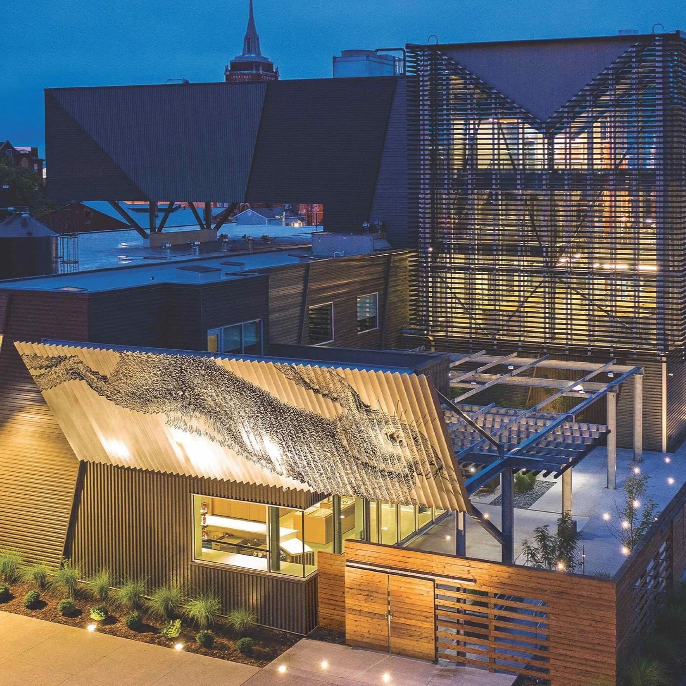
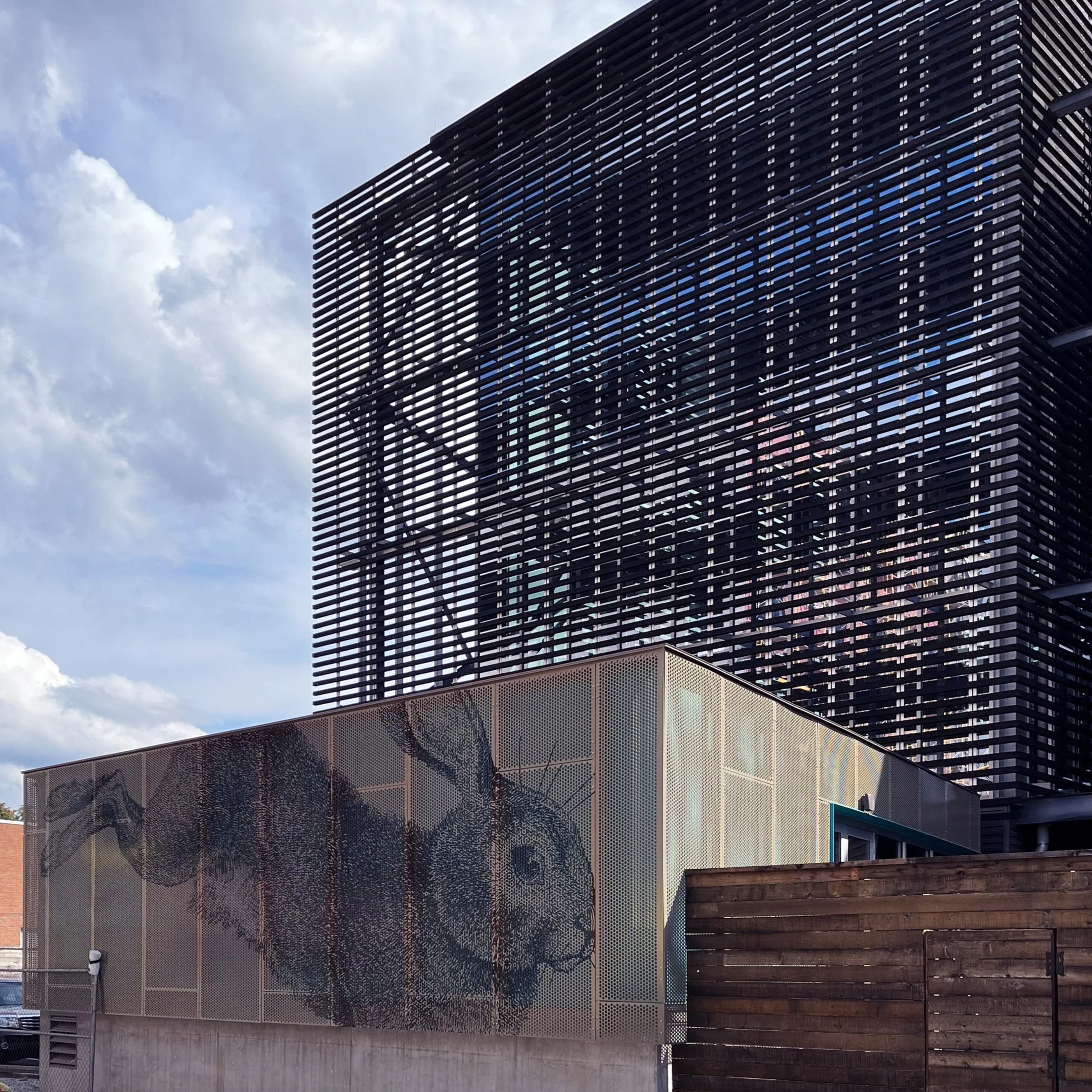
pod a+d is especially proud when the firm's Commercial work has far-reaching benefits for the places where they're built. The Green Building, for example, sparked a revitalization of an entire downtown Louisville district. For a building to house three new, huge fermentation tanks at Rabbit Hole Distillery, Doug and Youn saw more than a utilitarian structure. They designed it as a transparent pavilion that greets visitors along two entrances to the campus by day. At night, it becomes a lantern in the dark for city pedestrians and Rabbit Hole staff members.
As experienced master planners, Doug and Youn are often involved in a Commercial project's pre-design phase, helping their clients find the best sites for their enterprises, for example, and maneuvering their projects through permits and other necessary processes.
With their Commercial projects, Doug and Youn enjoy working closely and cooperatively not only with their clients, but also with the various engineers, contractors, consultants, civic leaders, building officials, artists, and artisans -- all of the people, opinions, and ideas necessary for successful Commercial projects.
HOSPITALITY
hotels/motels, restaurants, and bars
"Travelers are seeking hotels...with purpose and meaning, where lifelong memories can be created." ~ Stacy Fischer-Rosenthal, president, Fischer Travel Enterprises, to Architectural Digest.
Old became new again for two of pod a+d's high-profile hotel design projects, one of which has been creating lifelong memories for its guests for over 90 years. Both involved renovating older properties to restore them to their original elegance while incorporating state-of-the-art amenities and additions. For the Hollywood Roosevelt, Doug and the design team recaptured the hip, upscale image that this boutique hotel exuded when it opened in 1927 and became a favorite destination for stars and VIPs in the film industry. (It was also the setting for the first Academy Awards in 1929.) Sixty Beverly Hills, a complete renovation plus two new outdoor levels, recalls the luxury and chic style of the mid-Seventies. Both suggest a sustainable method for reinventing existing properties to appeal to 21st-century guests.
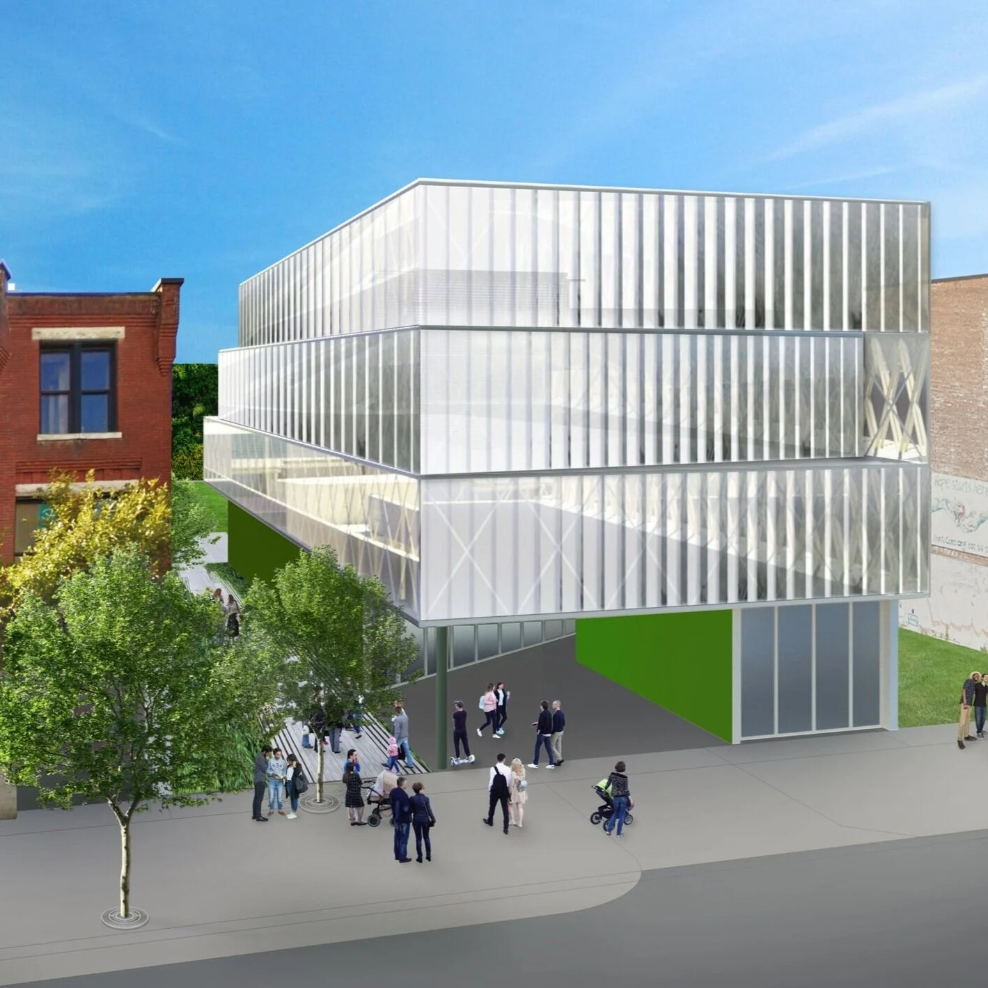
By contrast, the conceptual design for a brand-new Bourbon Hotel, planned for Louisville, KY, suggests an innovative way to make commercial construction quick, “green,” and much less expensive than standard construction.
"The details are not the details. They make the design." ~ Charles Eames
Cuisine, context, and details are keys to pod a+d's restaurant and bar/lounge designs, tempered by a modernist discipline, innovations, and the imperative to solve logistical, operational, and functional problems. For example: Connie & Ted's is an upscale seafood eatery in West Hollywood where the design team translated typical nautical images into abstract expressions befitting its hip setting. For RIN Restaurant in Beverly Hills, modern, minimalist architecture and interior design reflect the centuries-old tradition of fine craftsmanship and elegant simplicity ideal for its setting. And with the concept for Little Victory Bar in Louisville, Doug and Youn acknowledge its connection to Rabbit Hole Distillery through materials choices while its form establishes its individual identity within the neighborhood context. These and other restaurant/bar designs suggest "sense of place" (context) as a strong key to the establishments' design integrity.
DISTILLERIES/BREWERIES
artisanal spirits distilleries, craft beer breweries
"Out of nothing… on a place that was a run-down warehouse and a vacant lot, there is now a building that raises the bar in the science of distillation and the art of hospitality. In the heart of Louisville...[Rabbit Hole Distillery is] a modernist cathedral built around the process of making whiskey." ~ Kaveh Zamanian, Rabbit Hole founder, for DistilleryTrail.com
"This is absolutely a modern monument to our historic industry.” ~ Eric Gregory, president, Kentucky Distillers Association for the Louisville Courier-Journal
Rabbit Hole Distillery in downtown Louisville has redefined the city's celebrated Urban Bourbon Trail. In an industry steeped in tradition, this 55,000-square-foot facility introduced a visitor-centric, "form follows process" concept along with surprising transparency from the outside in and the inside out. The primary building material is 21st century metal. In short, pod a+d's design proves the spatial compatibility between the manufacturing process and hospitality (touring/visitor spaces in harmony with workers' space) and extols the game-changing benefits of modern architecture in bourbon manufacturing.
Of course, Rabbit Hole is a large distillery, its campus covering an entire city block. Yet pod a+d's smaller distillery and brewery projects exhibit the same level of innovation, especially for adaptively re-using existing structures. For example: the upfit of the "public" space inside the small Liberty & Plenty distillery in an old brick warehouse in Durham, NC is a single modern unit with multiple functions. For a mid-sized distillery in Brooklyn, Doug and Youn developed an organization methodology that divides the raw space inside a post-Civil War warehouse into three categories based on usage between workers and visitors. And in Inglewood, CA, they turned an old silo and loading dock into Three Weavers Brewing Company.
These and other projects demonstrate innovative problem-solving in distillery/brewery architecture that celebrates the juxtaposition between the old and the new.
CULTURAL & ACADEMIC
museums and galleries, art centers, libraries, educational facilities
"Noble life demands a noble architecture for noble uses of noble men." ~ Frank Lloyd Wright
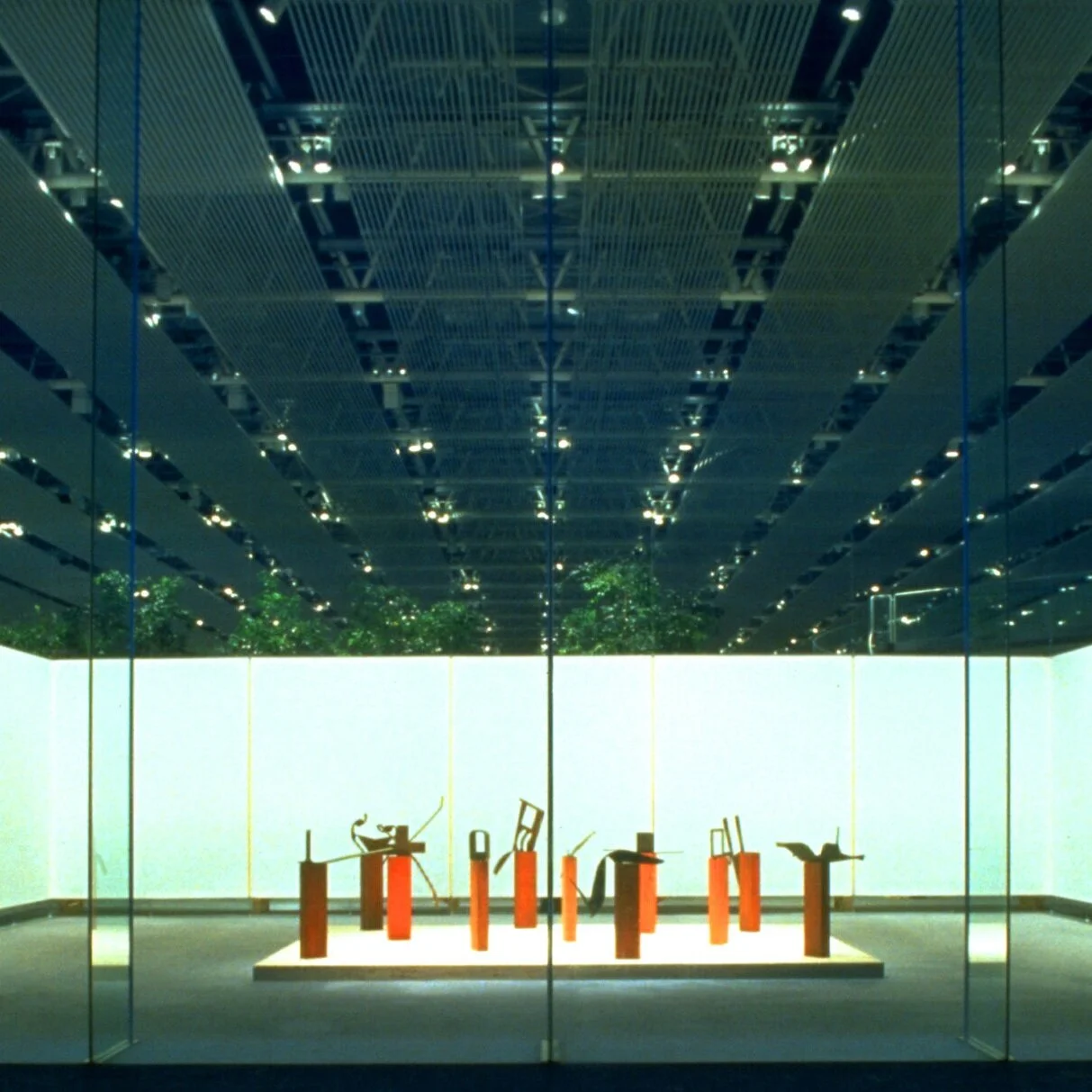
By fusing architecture, art, experiential design, and technology, Doug and Youn have created rich narratives around specific exhibitions for museums, galleries, international traveling exhibits, and a public art project. For a permanent exhibit in Coronado Island's history museum, for example, custom cabinetry, swiveling displays, and bold graphics add visual and textural depth around primarily two-dimensional art. Inside the Sainsbury Centre in Norwich, England, the building’s steel and glass detailing became the backdrop for a minimal stage set for touring exhibitions with back-lighting to illuminate the artwork and suggest an intimate enclosure within the building’s large volume of open space.
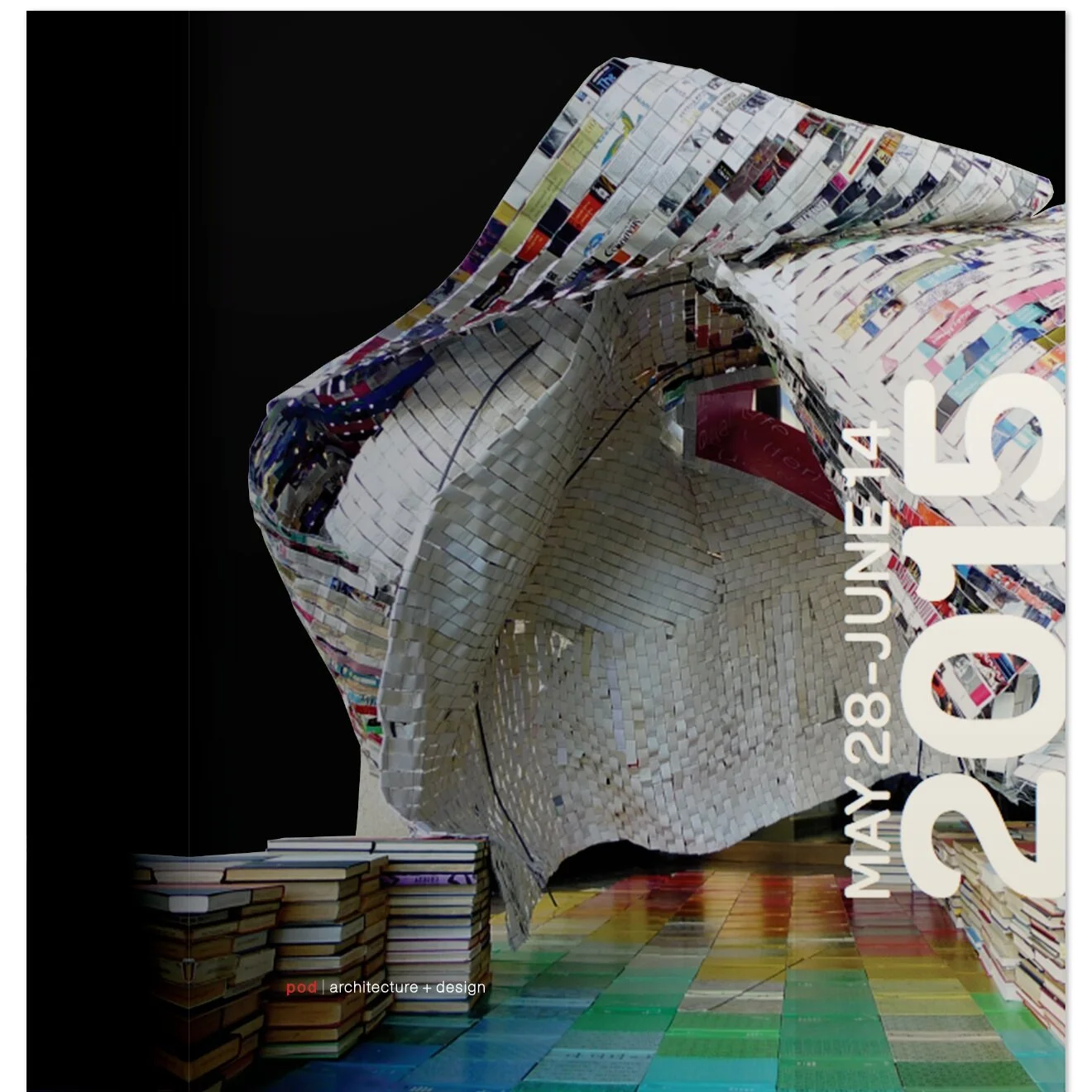
Two of their Cultural projects reached beyond the limitations of buildings to touch the hearts and minds of their communities. When one of the most comprehensive Asian art collections in the world moved into a stately 1917 Beaux Arts building in San Francisco, Youn created bold, eye-catching signage around the exterior of the new Asian Art Museum by greatly enlarging traditional/familiar Asian iconography. Form, color, and size were inviting contemporary elements against the historic building. But first, a giant veil over the entire building created excitement, buzz, and civic pride as the city awaited the grand unveiling. And in a public library in Inglewood, CA, thousands of decommissioned books, chicken wire, and rebar became, in Youn's hands, a 10x12x15-foot, interactive sculpture. But she didn't do it alone. Crowds of library visitors of all ages were thrilled to work together to help create that big, colorful art object that delighted more visitors every day.
"We shape our buildings; thereafter, they shape us." ~ Winston Churchill
A vibrant educational experience that shatters stereotype-- that has been the impact of the combination gym and performing arts facility that Doug and Youn designed for St. Francis School in Goshen, Ky, population 1009. The school wanted the building to embrace its environmental and educational values, including social diversity. To that end, the systems for environmental sustainability informed the design, becoming visible components. Other elements guaranteed that the dual-purpose facility would surpass the Americans with Disabilities Act compliances. The result: The Athletics Facility helped this school establish and express its identity as a progressive educational institution, belying the stereotype of a rural school in a small town. In turn, the tiny town of Goshen is also elevated above stereotype.
URBAN / MASTER PLANNING
Our vision imagines a continuously flowing urban tapestry with bridges and linkages between uses, neighborhoods, infrastructure, and communities in environmentally and culturally beneficial ways. ~ Doug Pierson, Youn Choi
California's LA County is one of the largest, most populace counties in the U.S. When its Metro Transportation Agency needed to move very large crowds of people quickly and efficiently through its new Harbor Gateway Transit Center -- along its ultra-busy "Silver Line" bus system -- Youn's expertise in experiential graphics and wayfinding systems, and her affinity for simplicity, allowed her to meet this formidable challenge with a new graphical language and large, bold color scheme that travelers can see, comprehend quickly, and follow from a distance, even in the midst of a teeming crowd. As a result, Harbor Gateway Transit Center is the branding and wayfinding flagship for current and future stations throughout the Metro Silver Line.
This is only one example of the Urban Transportation challenges that pod a+d has met by integrating the design team's skill sets.
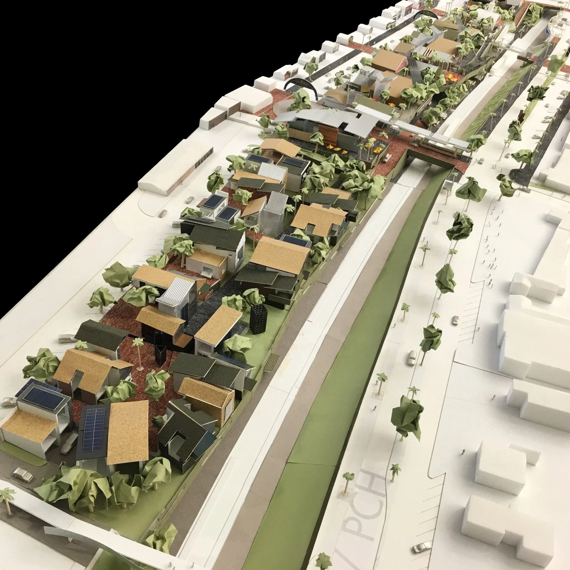
Innovative Master planning -- a blueprint, of sorts, for future building and development -- often provides benefits that even the client hasn't considered when the pod a+d design team's various disciplines work in tandem. For the Inglewood Seniors' Center, for example, Youn's instinctive quest for harmony between humans, nature, and built structures fused with Doug's holistic approach to modern architecture to create a concept involving three design elements specific to the health and well being of seniors, including connectivity to the people outside the Center. When built, residents will easily meet and come to know the neighborhood folks, thus enriching their lives and the lives of the people of they meet.


